
Cosmic Rewards
ROLE: Product Designer & Illustrator

CLIENT
Cosmic Rewards is a loyalty reward Android app, where you’ll be able to discover new apps to play and redeem Stardust (in-game currency) for gift cards.
PROBLEM
The previous app lacked consistency and uniqueness. The client was looking for a more modern feel that could enhance the product and built trust with the user. This meant completely revamping the product from start to finish.
SOLUTION
This entire app was worked on with my design partner and Creative Director. We built an entirely new Design System, Illustration Style, and more. I took lead on a couple screens as well as the logo and illustrations. The app now, has a consistent and more modern feel.
AFTER RELAUNCH

4+ Stars
On GPS
Fastest Reward to Play App
300%+
MoM install growth in last 3 months
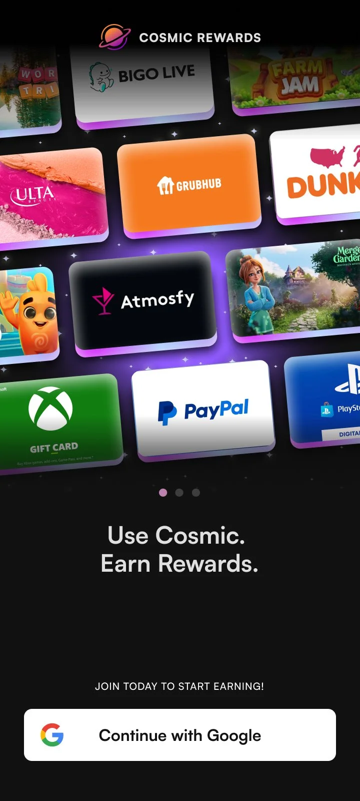
I was tasked to redesign the Cosmic Rewards sign-up flow and the entire Onboarding process with our new colors, font and style. We wanted to provide enough information to the user so they know exactly what they’re signing up for.
Sign-up & Onboarding Flow For New Users
01

Previous Login screen 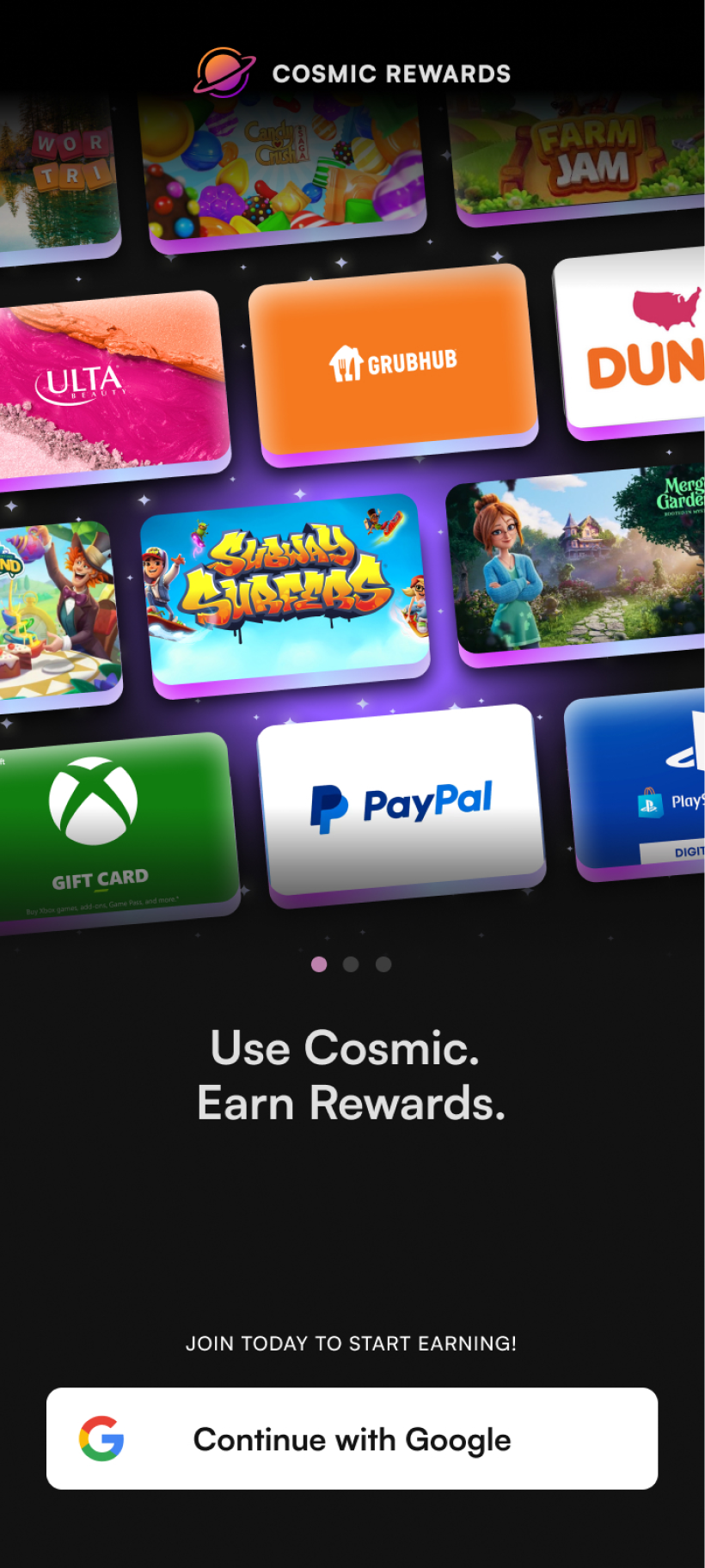
→
Current Login screen User's pain points on the previous Sign-up & Onboarding flow:
Too long of a sign up process!
Why do you need this much information?
What gift cards do you have?
What even is this app?

Previous Onboarding Flow Issues:
Not enough clarity on how users earn rewards
No sneak peak of our rewards
Too long of a flow for user
Missing Information as to why user needs to grant permissions, causing sudden drop-off
Buttons are too small for the user
Missing a welcome bonus to build retention
Research & Wireframes
While researching our competitors, the team and I noticed that majority prefer a welcome/information screen before allowing the user to sign up. This allows the user to get a sneak peak on what the app is about and how they could potentially earn rewards.
Their onboarding flow after signing up is short and sweet, something that we we’re missing on our flow. Some comments we have received on our testimonials and surveys, is that our users feel as though the process is too long and confusing.
research: competitors


WireframesFinal Sign-Up Flow


Final Onboarding Flow


Onboarding Flow Improvements:
moments of delightThe overall flow is shorter, and has moments of delights with illustrations, animations and a reminder that a Welcome Bonus will be given after onboarding.
Demographics & avatarsBy combining demographics with the Avatar screen, we shortened the flow altogether. Now when the user creates a profile the process appears seamless.
new grant permissions screenInstead of the user having to click through three different screens that takes them to their phone settings three different times, it simply gives them the option to go to settings once.
02
Hyper Speed Promotion
I was tasked to Design a Promo element with my design partner in order to increase retention on Cosmic Rewards. Our goal was to create a In-App Promotion that our users can look forward to and gain a reward as quickly a possible. We collaborated on the direction and I took lead on the illustrations and animations.


User's pain points on earning with Cosmic Rewards:
It takes too long to get a gift card!
I don’t understand the challenges.
Playing too long for no reward!
How can I earn stardust quickly?

What our users want:
After interviewing and sending out surveys to our users, it was clear that the number one frustration was how long it takes to earn a reward while using Cosmic Rewards, and the number of games you can select from. While asking them for suggestions, several mentioned that maybe there could be challenges that are quicker to finish.
Goals & Wireframes
1. asking questionsHow can a user quickly earn either $2.50 in 24hrs or $5 in 48hrs? The goal was to create a shortcut to get users to their first payout.
A user can earn stardust through downloading games, in-game goals, IAP, hot streaks. How can we guide the user to completing these items within the first or second time in app?


1. Exploration & WireframingThe rules are simple, user downloads two games, finishes each challenge within 48 hours and boom! Reward.
In order to make this Promo as engaging as possible, we made it a priority to to add elements of delight. While the user finishes each challenge, the rocket ship goes along the progress bar and lets the user know they are almost to their $5 reward!
Final Hyper Speed Flow


Final Hyper Speed (Flow) Full Screens Explained
what the user first sees (full screen)
What the user sees when they are shown the Hyper Speed Promo. First step is to download two games.
after user downloads two games/ slide up component
After user downloads two games, the games section disappears and the slide up component explains each challenge.
after user scrollsThe progress bar stays sticky at the top. This will allow the user to see their progress regardless of where they’re at on the screen.
As the user continues
As the user continues their journey, they have the opportunity to see their progress as the rocket ship moves.
Completed state
The Hyper Speed Promo will go to an automatic completed state for the user to see their finished journey.
Reward pop-upAfter the user completes all the challenges (within the 48hr timeline) a pop-up appears aare rewarded $5 in stardust!
03
Profile & Avatars
In order to improve the user experience, I was tasked to redesign the profile screens with an entirely new style, colors, type, etc. The overall goal was to provide an engaging and personalized page for the viewer. By combining their profile information and their recent activity, the viewer is able to see their entire progress.

Previous profile screen→

Current profile screen
Previous Profile Screen Issues:
Missing avatars
lacking style, color and delight
Missing user’s specific earnings
Missing components from new Design System
Missing Game/App icons
Research & Wireframes
The previous profile design lacked uniqueness, the user’s achievements, and the avatars. The past design had the User’s earnings on a completely different screen, tucked away at the bottom of the hamburger menu.
1. Previous profileDuring the research and wireframing part, I noticed that it is common practice for the user’s records to be displayed on the profile screen. I decided that the best course of action was to combine all of the users achievements and information onto one screen.
2. research: 2 screens into 1

Final Profile Screens


Avatar Designs
As a Product Designer with illustration experience, I was tasked to come up with 6 unique avatars. For this app, the goal was to create multiple Avatar options that the user can choose from. We hope the playful, colorful avatars drive engagement and encourages users to come back to the app for more.


