
HighSpeedOptions
ROLE: Product Designer

CLIENT
HighSpeedOptions is your one-stop shop for internet and TV plans, whether you want to compare bundles or know exactly what speeds you need for your daily internet activities.
PROBLEM
The HSO comparison pages were both lengthy and lacked side-by-side components for the user. There is no specific tool to filter which providers the user wishes to compare.
SOLUTION
I redesigned the comparison pages with multiple components so the user can get a better understanding on both providers. I also created a dedicated tool on a single page for users to select and compare specific providers, housing all comparison pages in one place.
PAIN POINTS:
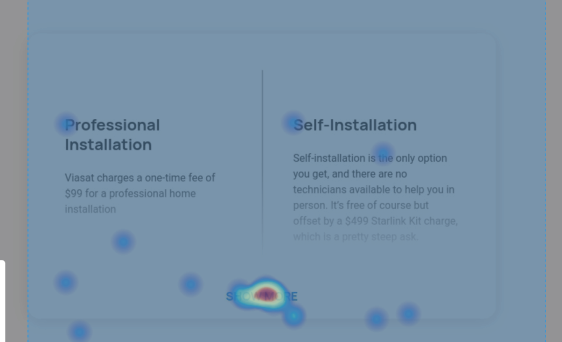
More than 60% of users were exiting the page after scrolling on the hero image on both desktop and mobile
Due to the lack of scrolling, users were not interacting with the page nor clicking on the links.


01
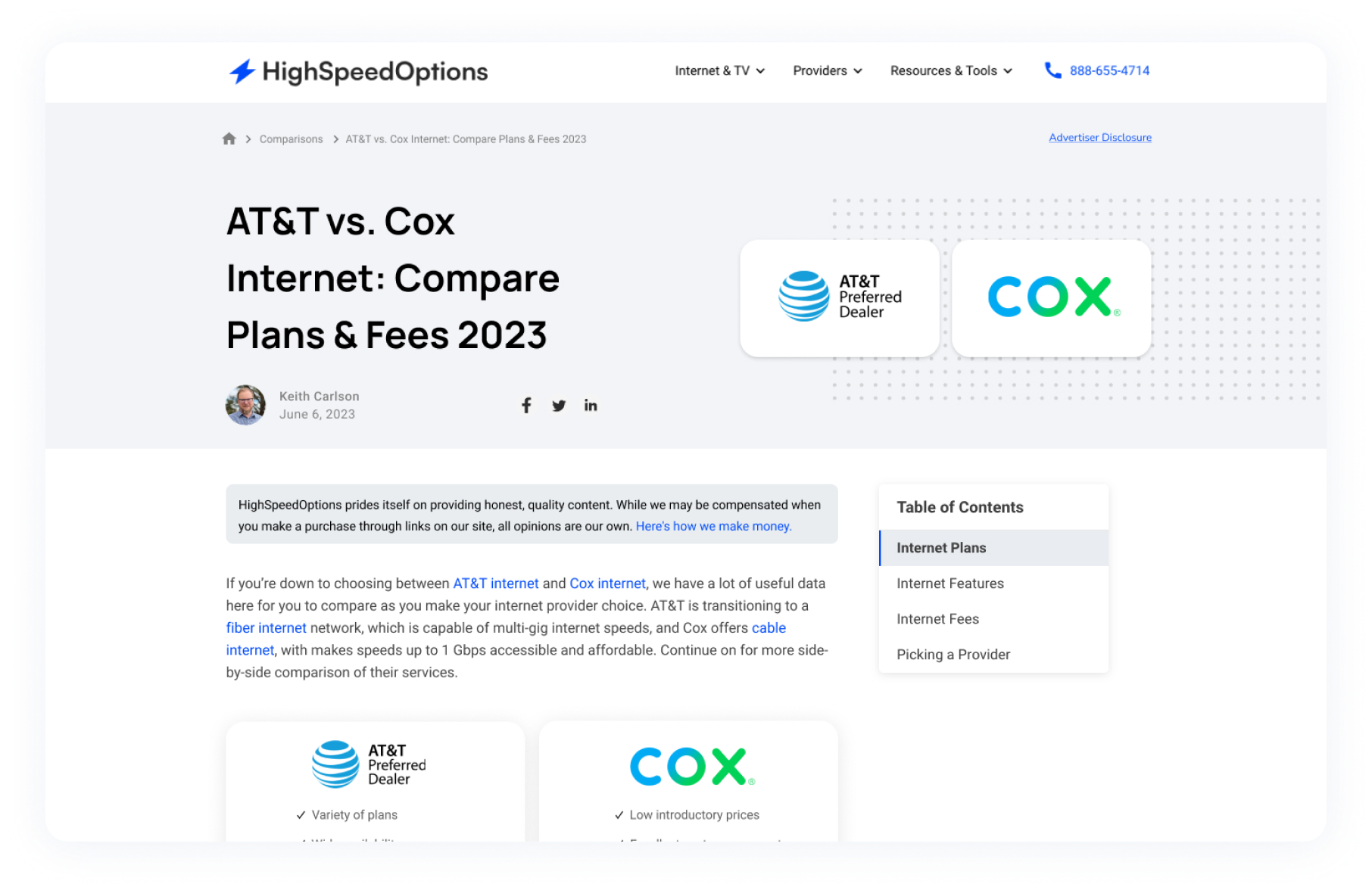
Comparison Template
Updating information above the fold
The HSO comparison pages allow viewers to compare two providers at a time. I was tasked to redesign the comparison pages so the Copywriter can utilize it as a template and create content involving multiple providers for ours users. The goal was to make these pages digestible on both desktop and mobile.
Through out my research (utilizing the tool HotJar), I noticed there wasn’t a lot of scrolls or interactions on majority of comparison pages. I redesigned the header section and intro to move up the entire content above the fold. This allows the viewer to receive the information quicker and in a more effective manner.


02
Comparison Template
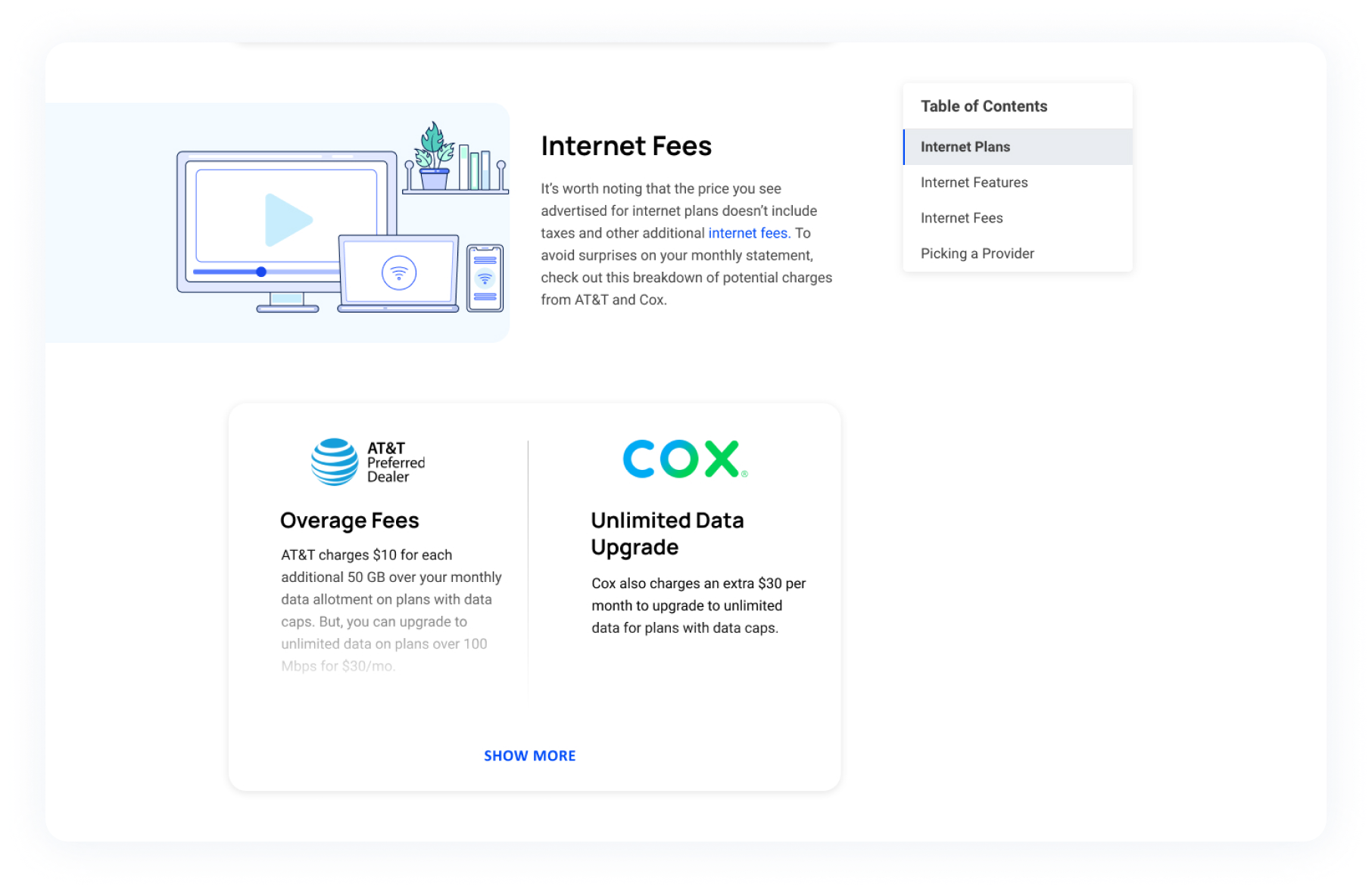
Creating New Components for Comparing Purposes
I noticed the previous Comparison Pages were text heavy and had no side by side components. Comparing providers was a difficult process for the viewer due to the format of the entire page. In order to improve the user experience, I added components that allow the viewer to to see side-by-side charts, tables and bullet points. This lets the viewer compare the internet providers in a seamless way.
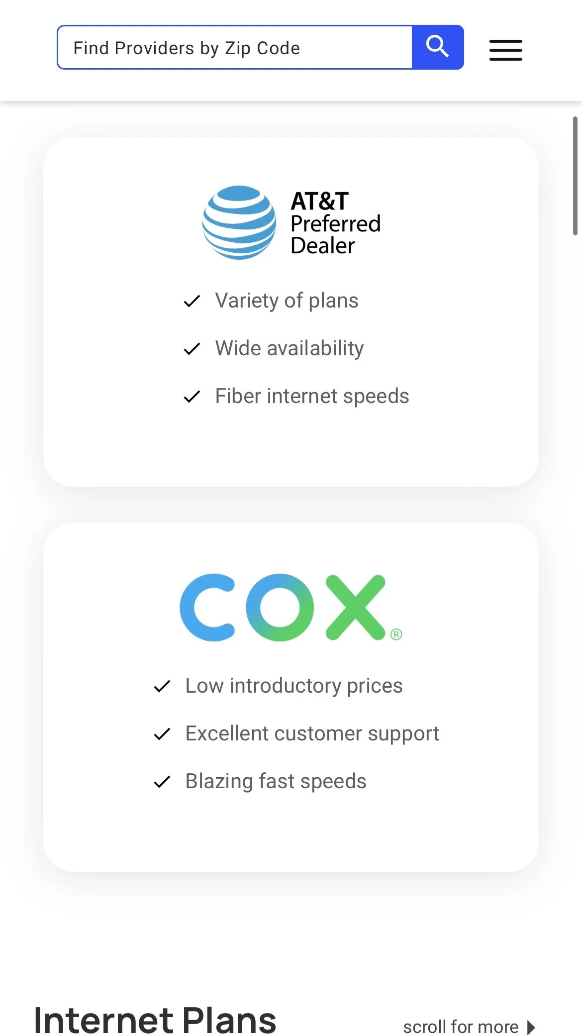
New Provider Components & Call-Outs

Side By Side Component for Internet Fees & Features
Provider Call outs component
list component 


Examples of Mobile Version


Final Design

KEY TAKEAWAYS
After the redesign, more than 50% of users scroll all the way to the bottom (on both mobile & desktop) of the article and interact with the internet provider links, zip search, compare components and more!


03
Creating a Compare Tool
Due to the amount of Comparison pages, the team and I decided to move forward with creating a compare tool for the user. This will allow the user to filter through and decide which providers they wish to compare. It also displays the entire Compare Pages and some useful resources on the side.

final desktop version
final Mobile versionBranding
Illustrations & Icon Library
I was tasked create an entirely new, and unique illustration & icon style by using the lighter and darker version of HSO’s brand colors.


